It’s a new year and with it comes a new trend in paint colors. They are neutral, low-key and comforting as well as bold and stimulating. Some of them are:
The Mellow Tones
Cloudberry is a paint offered by Olympic. It is a restful, silvery-mauve color that looks good in a bedroom dominated by other cool pastels with occasional pops of color like a lamp with a bright blue glass base.
Kettleman from Kelly-Moore is a dark gray, but has enough warmth to interest homeowners who usually find gray colors fairly cold. Since it is dark, it may be best to use it in small areas such as interfenestration, closet doors, moulding or baseboards.
Soft Silver Sage from Valspar is another color that adds peacefulness to a room. Like cloudberry, it works best with other neutrals and cool colors. Pops of intense, warm colors should be used sparingly with this color.

Poised Taupe from Sherwin-Williams is a “deep neutral” that is perfect to take the starkness out of a mainly black and white room. It gives a feeling of warmth or a feeling of coolness that seems to depend on the viewer’s mood or the season or the time of day. Because of this, it is a very versatile color.
Shadow from Benjamin Moore is a dark purple with a hint of gray. In low lights it can appear black. Because of this, care is needed in its application. Like Kettleman, a little of Shadow can go a long way.
The medium blue-violet-gray of Glidden’s Byzantine Blue has enough warmth to attract people who dislike cool colors and enough coolness to play well with many other hues.
The Brighter Tones
Even more merry and bright is Valspar’s aptly named Here Comes the Sun, which goes well with warm colors of red and orange.
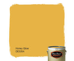 Dunn-Edwards’ Honey Glow has the perfect name. It looks like a paler, creamier sort of honey and brightens any room. If it’s painted on the front door, all will feel welcome.
Hot And Spicy from Behr is a type of brick red, while the company’s Fired Up is a burnt orange that reminds the viewer of the color of fall chrysanthemums. Lemon Burst is a shade of Naples yellow with enough orange in it to be bold.
Though green isn’t a warm color, the Pantone Color Institute has declared Greenery its color for 2017. It is a bright, bright green that reminds the viewer of sunlight pouring through a new leaf in the spring. Some homeowners may find it a bit too aggressively cheerful, so it’s best used in smaller areas.
Homeowners who aren’t sure what 2017 colors they should use should consult the professional contractors at Alair Homes Toronto for help.